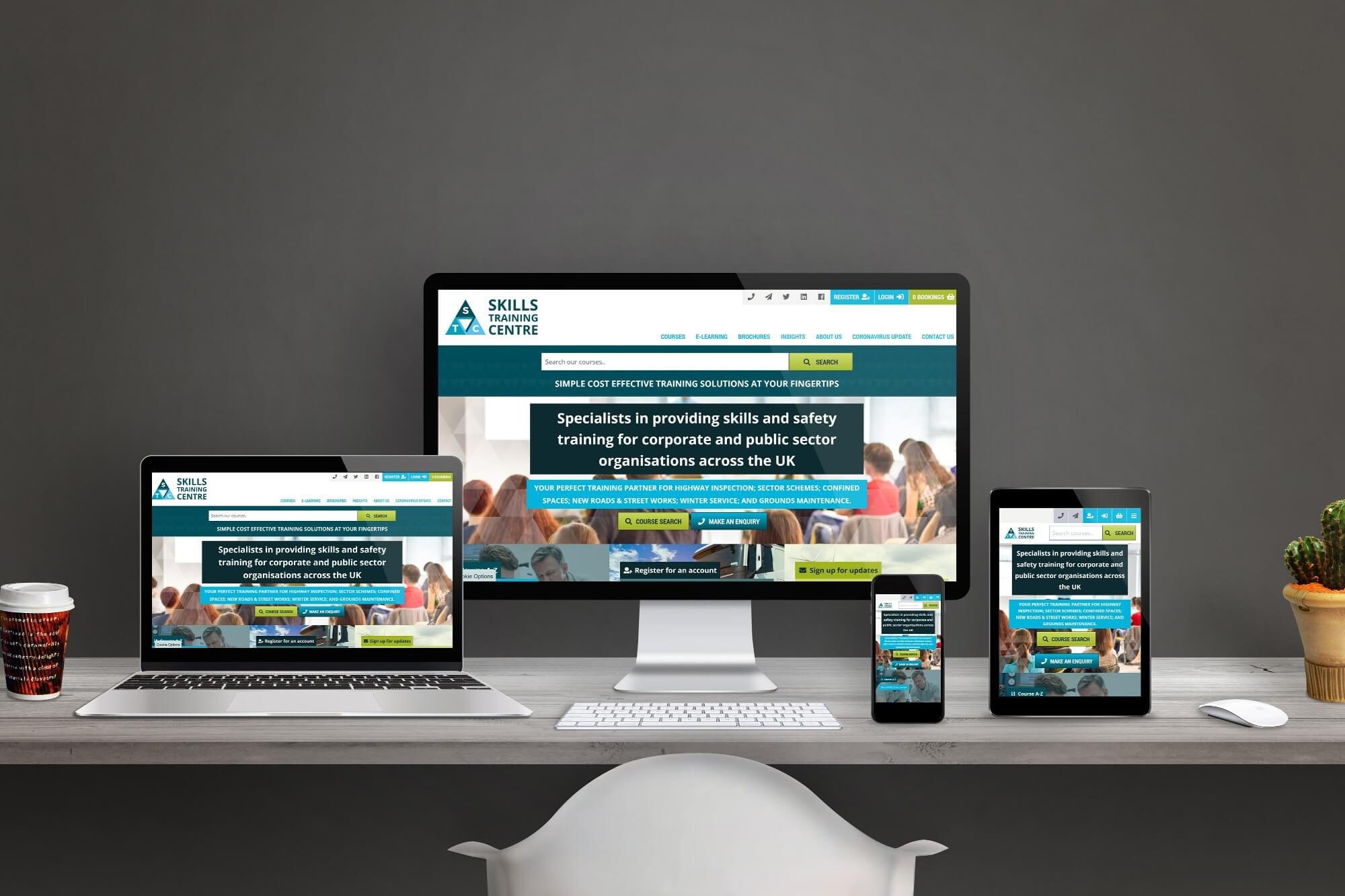
After 16 Years, Skills Training Centre Have Rebranded
In September 2021, Skills Training Centre embarked on a full rebrand of their company including a new logo and website. We spoke to the three Directors; Tim, Karen and Claudine to hear all about the rebranding and how they believe it will help benefit the business.
1. What made you decide to rebrand after 16 years?
Tim: In 2005 we moved into the private sector having been a Local Authority owned centre for some 20 years. A lot has happened in the last 16 years as we have moved, grown and broadened the range of programmes that we offer our clients.
We wanted to re-brand as part of a refresh of what we are doing as a company. In doing this we are retaining the core parts of what we feel makes us different as an organisation and where our roots started and still are. Providing opportunities and opening doors for clients and private individuals, being honest about what we can and cannot deliver and about the training offer we are making. Providing the best pre-course information and guidance we can. We have always provided and continue to provide discounted course rates to the unemployed and want to make a difference in society when we get the opportunity to do that. When we make mistakes owning up to those and putting things right.
Karen: We thought long and hard about whether we should rebrand or not. It was a big decision and not one we undertook lightly. We’ve been trading for a long time and have always had the same logo and colours etc. It was very comfortable and familiar - both for us and our customers, but ultimately I think listening to feedback about our website and branding from various people we all felt like everything was in need of a bit of a refresh.
We have big plans in terms of growth over the next couple of years so it felt right to rebrand now as we’re coming out of COVID with our new structure in place and now our new branding too. For me I love the new logo as I feel the triangle shape embodies the strength and resilience we’ve demonstrated over the last 18 months or so.
Claudine: After 16 years trading with the same logo we decided that it was time for a change and the last year and half has seen some major changes within Skills Training Centre with the retirement of one of the co-founders and the succession of two new directors within the company.
From an external viewpoint, now seemed as poignant a time as ever due to the pandemic and the lifting of lockdown measures. We wanted to show that we survived , are resilient and better than ever. It is also a nod to the changes in the digital space , bringing the Skills Training Centre brand up to date and in line with current trends whilst still keeping in line with the brand heritage.
2. How does your new branding support Skills Training Centre’s values and mission statement?
Karen: I think for me in terms of the colouring - the colour blue is associated with trust and loyalty. Our mission statement and our values are based around trust and loyalty - being honest and acting with integrity, always trying to surpass our customers expectations, treating people with dignity and respect whilst putting safety before profit. In terms of the logo, the triangle shape made up of four internal triangles represent pillars of strength.
Claudine: We believe in providing an informed, safe and qualified workforce for our clients helping them take care of their staff, provide safe and healthy working conditions and provide a competitive advantage. Our clients choose us for our friendly approach, knowledgeable staff and affordable solutions.
We want to be viewed as a source of expertise and information for our clients. To give our customers a competitive edge whilst serving the public by providing everyday functionality and practicality for the training we offer our clients.
3. How and why did you decide on those colours?
Karen: We considered the brand heritage - we’re known for the blue (albeit different shades of blue). The thing we changed predominately were the accent colours as previously we had used red which felt quite dark and overpowering even where it was only being used as an accent. Now we have nice bright shades of green and orange which look awesome! Once we’d settled on the blues for the main logo we did have some laughs choosing the accent colours - it’s interesting the different feelings and emotions that different colours can generate for people.
Claudine: Core to the Skills Training Centre colour palette is the nod to our heritage. We chose blue to be the primary colour as this symbolises knowledge, confidence and trust. It evokes emotions of calm, loyalty, integrity and responsibility. The colour white is known to convey balance, perfection and simplicity as well as hope and open-mindedness and the soft grey hues are used to neutralise and stabilise our communications.
Blue is what Skills Training Centre has been affiliated with all these years so wanted to keep to that familiarity. What we also wanted was to incorporate more complementary colours to the logo and website , not have them so stark and more in line with what is out there in the digital space.
4. What did you change?
Karen: In terms of the logo we changed the shape (square to triangle) and the colours. We’ve switched the fonts we used and during the rebranding process we got much clearer in our mission statement, our values and our brand archetypes which I think has helped us find our places as a new senior management team. In terms of the full rebrand we’ve changed literally EVERYTHING!
I mean we’ve been trading for 16 years - that old logo is everywhere! We thought we had a good list of everything that needed updating once the new logo was finalised but we kept finding things we hadn’t thought of!
Claudine: We changed the logo from square to triangular because we feel that the three arrows/triangles are all directional both to the location and giving the impression of focus and attention. The inner shape and overlays are designed to convey a theme of continuous movement which represents our continuous growth and improvements. An evolution of the brand over 20 years.
5. What do you hope will be the benefits of your rebrand?
Tim: We hope that you like the re-branding. The benefits we are hoping for are to:
-
Give our customers a more enjoyable experience on our website and in so doing better share the range of courses we have available that may be of benefit to them.
-
Better articulate our values as a company with a fresh look based on the same core foundations of honesty, service and integrity.
-
Continue to provide support to others in our community with an added focus of support to two particular communities in need
-
Use the green and blue to reflect our intentions to improve on our environmental processes and procedures to the benefit of us all.
Karen: I hope that it will attract attention! I hope it gives us a bright, modern new look that will ultimately help us achieve our growth goals and see us through at least the next 16 years!
Claudine: To grow and develop our base of loyal customers and continue to establish trust with our client base. We wanted to show our evolution and create an identity that depicts that we are adaptable , resilient and competitive especially in the current climate.
If you wish to gain further insight into our company rebrand or have any questions about what Skills Training Centre can provide for you, please get in touch.
